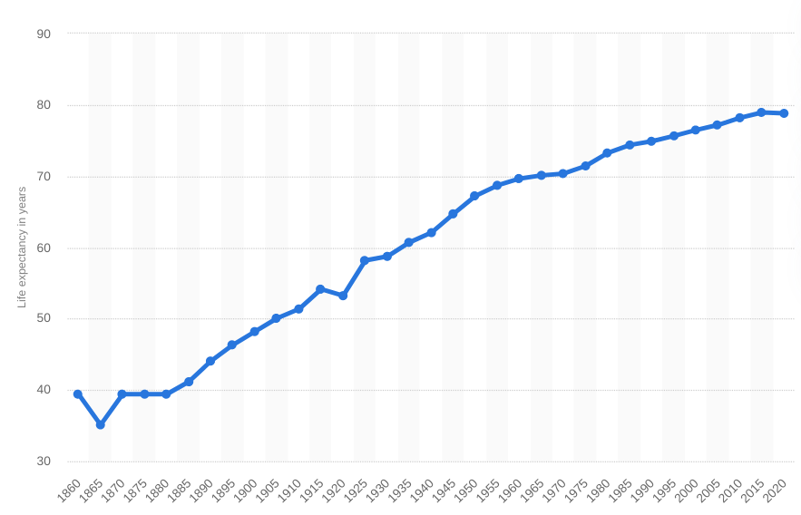
The graph above shows life expectancy (from birth) in the United States from 1860 to 2020. Remarkable increase due to better sanitation, improvements to the environment and health care.
https://www.statista.com/statistics/1040079/life-expectancy-united-states-all-time/
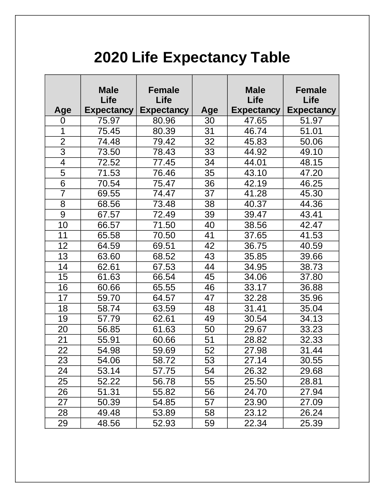
The tables below shows the years remaining in your life on average.
Women live longer then men. For a child born in 2020 the difference is nearly 5 years. For people who have reached 75 the difference is less than 2 years. And by the time you reach 115 the difference is zero.
Source: https://www.health.ny.gov/health_care/medicaid/publications/docs/gis/20ma08_att_i.pdf


No comments:
Post a Comment